JEDI Comport » Jedi Temple Main Hall » ((OOC Discussion))
-
Notifications ()
Notifications Settings
- You have no notifications
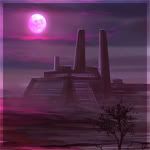
::JEDI:: Artwork
-
Blavek Araven
- Lost One
- Posts: 614
- Joined: Sun Mar 16, 2008 9:27 am
- Location: Alzoc III
-
Coren Ran
- Lost One
- Posts: 1000
- Joined: Sat Feb 03, 2007 4:18 pm
- Location: Rannon, Rannon System, Instrop Sector, Outer Rim Territories
- Contact:
But it's the combination itself that looks cool.Blavek Araven wrote:Thank you, just a combination of the official GA and CW logo's. Sure there is plenty more to come yet, but I appreciate the comments nonetheless.

| mentor_xa'o.zalei | padawans_atrux.nuro/zekii.abrak/agitt.tanwa/rei.xaria/nico.keztor/jerex.sol/krei'dexx'onubi/wolo.tay |
-
Illrian Damaris

- Lost One
- Posts: 1425
- Joined: Thu Apr 15, 2010 3:15 pm
- Location: Enclave on Alzoc III
- Contact:

-
Baelin Raddyx

- Lost One
- Posts: 766
- Joined: Mon Dec 28, 2009 11:39 pm
- Location: Alzoc III
-
Sared Kilvan
- Lost One
- Posts: 1037
- Joined: Sat Aug 16, 2008 12:11 am
- Location: Pouring like an avalanche coming down the mountain.

-
Baelin Raddyx
- Lost One
- Posts: 766
- Joined: Mon Dec 28, 2009 11:39 pm
- Location: Alzoc III
The only symmetrical ones were Blaveks? Actually scratch that a couple of ethans were too but thats it I think
Last edited by Baelin Raddyx on Mon Jul 19, 2010 11:43 pm, edited 1 time in total.

| age_22 | height_2.6m | weight_125kg | race_human | mentor_simus.cnydaria
-
Alkur Tekeil
- Exiled
- Posts: 1362
- Joined: Mon Apr 07, 2008 1:34 pm

-
Sared Kilvan
- Lost One
- Posts: 1037
- Joined: Sat Aug 16, 2008 12:11 am
- Location: Pouring like an avalanche coming down the mountain.
-
Ruluk

- Lost One
- Posts: 438
- Joined: Wed Jan 06, 2010 1:04 am
- Location: NOT the Jedi Enclave of Alzoc III, clearly ¬¬
Don't get me wrong. I like Blavek's designs a lot. I just don't think that they fit that much into a military organization. Maybe it's just me.

Jedi Padawan | Birth 275.08 | Initiation 280.31 | Master Fane Ornn'ila


-
Rash Loist
- Lost One
- Posts: 958
- Joined: Sun Apr 30, 2006 3:06 pm
- Location: Deceased
-
Baelin Raddyx
- Lost One
- Posts: 766
- Joined: Mon Dec 28, 2009 11:39 pm
- Location: Alzoc III
While we're on the subject of logo ideas, can someone please make a fancy schmancy logo for Raddyx corp? Likely the letters "RC" in basic would be in it, and it shouldn't be too big. SAYING THAT, make the logo aactually very large for when its put into the map and everything. I need it for the Raddyx maps that are under construction. Tyvm ^_^
| age_22 | height_2.6m | weight_125kg | race_human | mentor_simus.cnydaria
-
Garik Kelzim
- Posts: 218
- Joined: Thu Sep 03, 2009 11:55 am
- Location: Coruscant ::JEDI:: Temple
Yeah Blavek's done a great job. 
Last edited by Garik Kelzim on Tue Jul 20, 2010 4:20 am, edited 1 time in total.
Name: Garik Kelzim| Species: Miraluka| Initiated: 276.24| Masters: Tomoran Serevarno
"Five naps a day keep A-48 away!"
"Five naps a day keep A-48 away!"
-
Nira'kalen'nuruodo
- Lost One
- Posts: 702
- Joined: Wed May 28, 2008 2:11 pm
- Location: Alzoc III
My favourite so far is Blavek's second effort (the all black one). Individual units can still have their own insignia, but for a unified Coalition logo, that combination of the GA and Commonwealth logos is perfect. It's clear, easily identifiable and attractive.
That's not to say the other attempts aren't, but they could be anything. Seeing them crop up for particular fleets/units would be nice, though.
That's not to say the other attempts aren't, but they could be anything. Seeing them crop up for particular fleets/units would be nice, though.
Nira'kalen'nuruodo
"Strive not to be a success, but rather to be of value."
|age_53|height_1.7m|weight_85kg|species_chiss|mentor_cyril.feraan|padawan_eugen.darkrider_nastajja.arren|
-
Fane Ornn'ila
- Lost One
- Posts: 567
- Joined: Sun Jun 28, 2009 7:58 am
I actually like Blavek's. they may be ' just ' a combination but it makes sense haha. nicely done, I was even gonna do that 

edit; One thing I think we should avoid is things like depth that some of the last ones have. It's nice for just a logo but I would guess there should be used on some official skins at one point... flat logos are nicer in this case, me thinks.
Trying to avoid all those 3d and funky effects myself
edit; One thing I think we should avoid is things like depth that some of the last ones have. It's nice for just a logo but I would guess there should be used on some official skins at one point... flat logos are nicer in this case, me thinks.
Trying to avoid all those 3d and funky effects myself
Fane Ornn'ila - Jedi Knight
¦ Mentor: Kaelen Sekura ¦